


Notes from Scrimba Advance React course
React allows to create components that can be re-used anywhere its needed in the application. This helps simplify codebase in larger code-bases. The listed topics include:
Children
Compound Components
Context
Composition
Render props
Custom Hooks
Children in HTML
<button>Click Here</button>

<!-- or -->
<select>
    <option>Choose Colors</option>
    <option>Blue</option>
    <option>Yellow</option>
    <option>Red</option>
    <option>Orange</option>
</select>
React Children
export default function Button(props) {
    return (
        <button>{props.children}</button>
    )
}

//App.jsx
function App() {
  return (
    <main>
      <Button>Buy Now!</Button>
    </main>
  )
}
More Complex React Children
The concept of adding children to custom components can get complex but below is a simple example of it.
Adding an icon along with the button text. The tedious way is using a library, passing an SVG or using React element with location .
function App() {
  return (
    <main>
      <Button icon="react-element/svg/icon-location">Buy now!</Button>
    </main>
  )
}
The other way using React children is; you can add to either right or left side
import Button from "./Button"
import { FaMoneyBill } from "react-icons/fa"

function App() {
  return (
    <main>
      <Button>
        Buy now!
        <FaMoneyBill />
      </Button>
    </main>
  )
}
The CSS on the button
button > svg {
    margin-right: 7px;
    color: green;
    height: 20px;
    width: 20px;
}
You can get React Icons from - https://react-icons.github.io/react-icons/
props spreading
If the code has a lot of props to pass to the component, prop spreading syntax can be used to brief the code.
export default function Button(props) {
    return (
        <button
            onClick={props.onClick}
            onDoubleClick={props.onDoubleClick}
            style={props.style}
            className={props.className}
            onMouseEnter={props.onMouseEnter}
            onMouseLeave={props.onMouseLeave}
        >
            {/*... etc. ...*/}
            {props.children}
        </button>
    )
}

//The shortened code can be like this
export default function Button(props) {
    return (
        <button {...props}>
            {props.children}
        </button>
    )
}
Please note the component will only be passed handlers that are recognized by the native element
function App() {
  return (
    <main>
      <Button style={{color: "green"}} onClick={() => console.log("Logging in...")}>
        <FcGoogle />
        Log in with Google
      </Button>
    </main>
  )
}
Destructuring props
The properties passed to the Button component are the same as above. Here rest is a variable name and can be named anything for the remainder of properties passed.
export default function Button({children, ...rest}) {
    console.log(rest)
    return (
        <button {...rest}>
            {children}
        </button>
    )
}
Combining Classes
If we want to add more than 1 className to the custom component, we may have to use 3rd party library https://www.npmjs.com/package/classnames or https://www.npmjs.com/package/clsx or otherwise only 1 className is applied whichever comes last.
Without using library:
export default function Button({children, size, ...rest}) {
    let sizeClass
    if (size === "sm") sizeClass = "button-small"
    if (size === "lg") sizeClass = "button-large"

    return (
        //only size gets applied
        <button {...rest} className={sizeClass}>
            {children}
        </button>
    )
}
One Way
export default function Button({children, className, size, ...rest}) {

    let sizeClass
    if (size === "sm") sizeClass = "button-small"
    if (size === "lg") sizeClass = "button-large"

    return (
        <button className={`${sizeClass} ${className}`} {...rest}>
            {children}
        </button>
    )
}
More professional way using classnames library:
import classnames from "classnames"
export default function Button({children, className, size, ...rest}) {
    let sizeClass = size ? `button-${size}` : ""
    const allClasses = classnames(sizeClass, className)

    return (
        <button className={allClasses} {...rest}>
            {children}
        </button>
    )
}
Overloaded Avatar Component
Overloaded components are not best practices for coding React apps in day to day life.The below is an example of how the same component is used to render for 3 different scenarios.
export default function Avatar({src, alt, children}) {
    if (src) {
        return (
            <div className="avatar">
                <img src={src} alt={alt}/>
            </div>
        )
    }
    if (children) {
        return (
            <div className="avatar avatar-letters">
                {children}
            </div>
        )
    }
    else {
        return (
            <div className="avatar avatar-icon">
                <IoPersonSharp />
            </div>
        )
    }
}

//App.jsx
function App() {
  return (
    <>
      <Avatar src="./images/bob.jpg" alt="Bob Ziroll" />
      <br />
      <Avatar>BZ</Avatar>
      <br />
      <Avatar />
    </>
  )
}
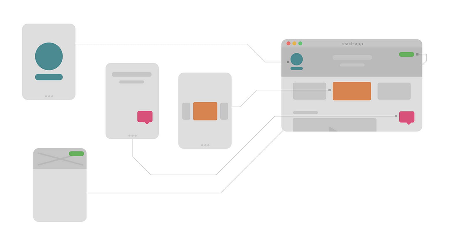
Menu Component
The code below explains the Menu component where everything is managed using props. This is how we as beginners in React will approach solving a problem with React.
function App() {
  return (
    <>
      <Menu
        buttonText="Sports"
        items={["Tennis", "Racquetball", "Pickleball", "Squash"]}
      />
    </>
  )
}

//Menu
export default function Menu({ buttonText = "Menu", items }) {
    const [open, setOpen] = React.useState(true)

    function toggle() {
        setOpen(prevOpen => !prevOpen)
    }

    return (
        <div className="menu">
            <MenuButton
                buttonText={buttonText}
                onClick={toggle}
            />

            {open && <MenuDropdown items={items} />}
        </div>
    )
}

//MenuButton
export default function MenuButton({ buttonText, onClick }) {
    return (
        <Button onClick={onClick}>{buttonText}</Button>
    )
}

//Button
//its the same as we built above

//MenuDropdown
export default function MenuDropdown({ items }) {
    return (
        <div className="menu-dropdown">
            {items.map(
                item => (
                    <div
                        className="menu-item"
                        key={item}
                    >
                        {item}
                    </div>
                )
            )}
        </div>
    )
}
The complications with a code like this can be
Inflexible/tightly coupled
Opaque
Not DRY
Prop drilling (Menu passing the props down to MB and MD)
Solution to above is a set of concepts
Compound Components
React.Children API
Context
Implicit State
Prop Drilling
Prop drilling happens when a component down the component tree needs access to data in a grandparent (or higher) component, and that data is manually passed down to each child component until it finally reaches the component that needs it.
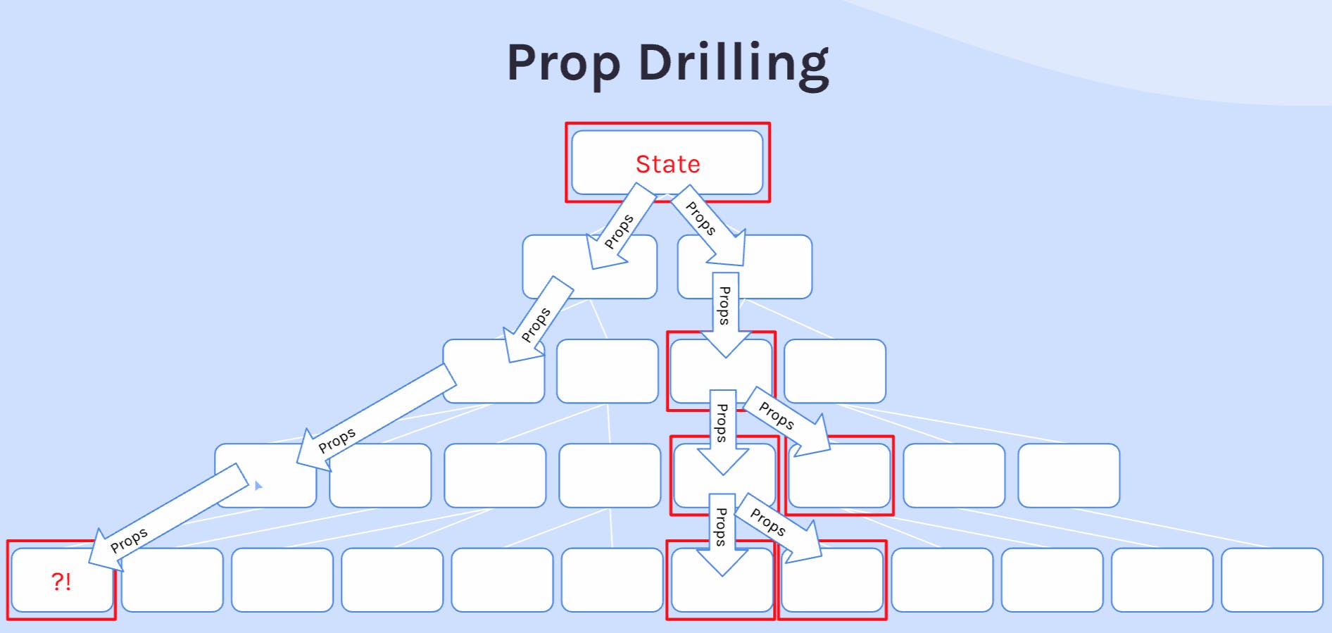
Solutions to prop drilling
Do nothing! (for small codebases)
Compound Components
"Flattens" the structure
Easily pass props to more deeply-nested components
Context
- Access state directly from the components that need it.
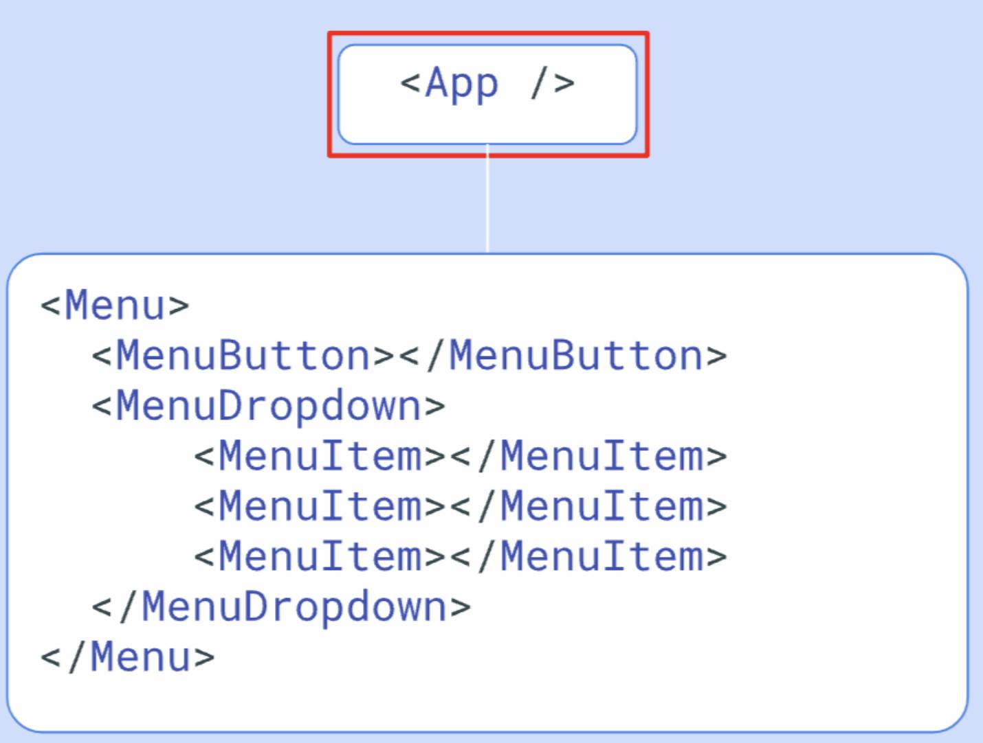
Compound Components
Composing components together either to add additional functionality or styling is not new.
HTML Examples 💡
<form>, <input>
<ul>, <li>
<table>, <thead>, <tbody>, <td>, etc
<select>, <option>
The primary things to know about using compound components are:
Use Children props
Have dedicated function/styling
Make the component structure more than transparent
Give more control to the "user" of the component
Initial Code without compound components
Compound Components FAQ
How do you define compound components to a layman?
Components that work together to accomplish a greater objective than might make sense to try and accomplish with a single component alone.
What are some examples of HTML elements that work together to add functionality or styling to each other?
<ul> & <li>, <select> & <option>, <table> & all the other table elements
How can compound components help you avoid having to drill props multiple levels down?
Compound component "flatten" the hierarchy that would otherwise be needed to pass props through. Since the parent component provides the children to render, the parent-most component has direct access to those "grandchild" components, to which it can pass whatever props it needs to pass directly.
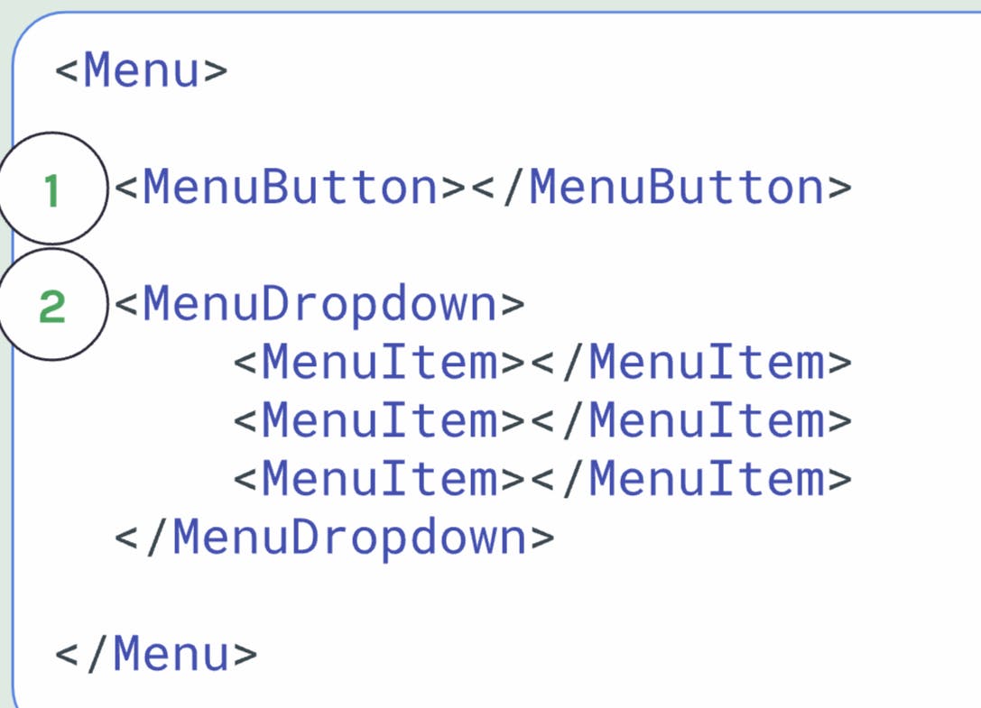
Code with Compound Components
Everything in the above code as props is re-defined as children and added as components. This is how the structure is now flattened.
Initial Layout

Flattened Structure with Compound Components
Even with this flattened structure, we are unable to make the toggle and click buttons work. Now how are those props/state passed to the right components? This is where the concept Implicit State comes in, a term coined by React community.
Implicit State - React.Children
utility that provides methods for interacting with a component's direct children elements
React.Children.map()
React.Children.forEach()
Others at React docs
React.cloneElement() - similar to Object.assign() will be used along with the React.Children.map() to provide required props to the components.
A utility that duplicates a React element and provides a way to inject element additional props to that element.
When used with
React.Children.map(), it can be used to "augment" the original children with new props
export default function Menu({ children }) {
    const [open, setOpen] = React.useState(true)

    function toggle() {
        setOpen(prevOpen => !prevOpen)
    }

    return (
        <div className="menu">
            {React.Children.map(children, (child) => {
                return React.cloneElement(child, {
                    open,
                    toggle
                })
            })}
        </div>
    )
}
These props are then respectively accessed in MenuButton and MenuDropdown in its usual way.
Shortcomings with React.Children
Fragile/Delete
limited in depth
The concept only works with direct children and if grandchildren of the component needs access to state, it will have to be defined in the parent component again. If MenuItem needs access to open or toggle states, they will have to be defined in MenuDropdown component in the same way as defined in Menu component.
React Context
A way to "teleport" data to the components in the tree that need it without passing props.
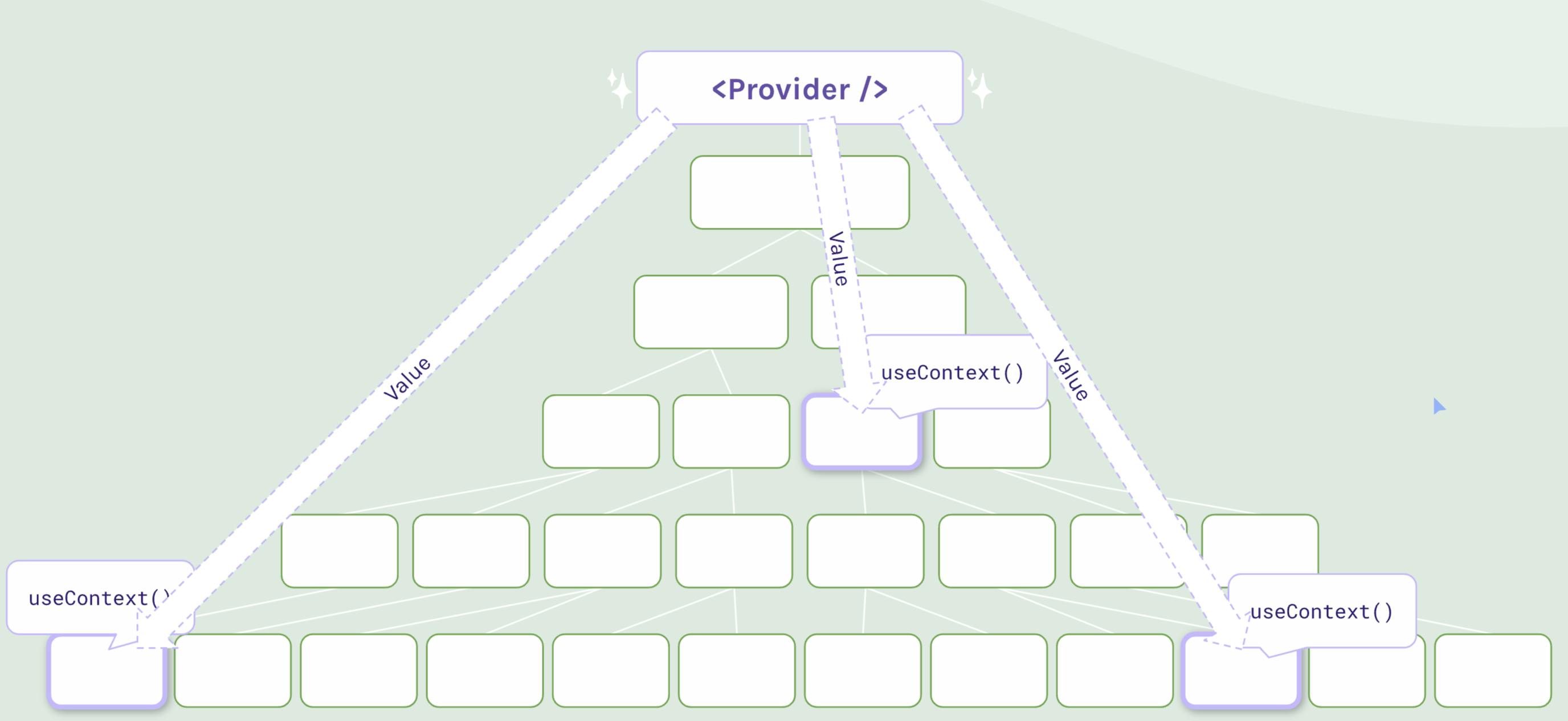
Provider component is added to the closest ancestor. The component is provided values the other components may need. Other components access these values using useContext hook.
createContext() & Context Provider
The context is created outside the component function so that it can be exported and accessed by other components. Then inside, the code is wrapped around Provider, providing the values. The values can vary from func, object or primitives.
import React from "react"

const ThemeContext = React.createContext()

export default function App() {
    return (
        <ThemeContext.Provider value="light">
            <div className="container dark-theme">
                <Header />
                <Button />
            </div>
        </ThemeContext.Provider>
    )
}

export { ThemeContext }
useContext()
The Provider children can access the values passed to the provider via useContext hook as shown below
import React from "react"
import { ThemeContext } from "./App"

export default function Header() {
    const value = React.useContext(ThemeContext)

    return (
        <header className={`${value}-theme`}>
            <h1>{value === "light" ? "Light" : "Dark"} Theme</h1>
        </header>
    )
}
State + Context
Both can work together for efficient functioning of the app. The context can pass values to multiple components that need it and state can be responsible for changing the values whenever needed.
//App.js
const ThemeContext = React.createContext()

export default function App() {
    const [theme, setTheme] = React.useState("light")

    function toggleTheme() {
        setTheme(prevTheme => prevTheme === "light" ? "dark" : "light")
    }

    return (
        <ThemeContext.Provider value={{theme, toggleTheme}}>
            <div className={`container ${theme}-theme`}>
                <Header />
                <Button />
            </div>
        </ThemeContext.Provider>
    )
}

export { ThemeContext }

//Button.js
import { ThemeContext } from "./App"

export default function Button() {
    const { theme, toggleTheme } = React.useContext(ThemeContext)

    return (
        <button onClick={toggleTheme} className={`${theme}-theme`}>
            Switch Theme
        </button>
    )
}

//Header.js
import { ThemeContext } from "./App"

export default function Header() {
    const { theme } = React.useContext(ThemeContext)

    return (
        <header className={`${theme}-theme`}>
            <h1>{theme === "light" ? "Light" : "Dark"} Theme</h1>
        </header>
    )
}
Headless Components
These components don't have any styled UI to display: they're purely intended to provide functionality. When one or more components have a same functionality, the components can be wrapped within a headless component to perform the function.
For example, the scrim shows code in 2 different ways of toggling a star. It is very similar to what the menu component above was doing. The Toggle component here is a headless component doing the same function as the Star component
Toggle Compound Components
The main toggle will set the following states to be shared on with the children. This is a headless component and will only share functionality.
Button ( to flip state)
On (what to display when Toggle state is "on")
Off (what to display when Toggle state is "off")
Display (Expose internal state to give more control to user)
Creating Toggle Component
import React from "react"

const ToggleContext = React.createContext()

export default function Toggle({ children }) {
    const [on, setOn] = React.useState(false)

    function toggle() {
        setOn(prevOn => !prevOn)
    }

    return (
        <ToggleContext.Provider value={{ on, toggle }}>
            {children}
        </ToggleContext.Provider>
    )
}

export { ToggleContext }
Creating Toggle Button Component
import React from 'react'
import ToggleContext from "./Toggle"

export default function ToggleButton({children}) {
    const {toggle} = React.useContext(ToggleContext)

    return (

        <div onClick={toggle}>
            {children}
        </div>
    )
}
Creating Toggle On & Toggle Off
import React from 'react'
import ToggleContext from "./Toggle"

export default function ToggleOn({children}) {
    const {on} = React.useContext(ToggleContext)

    return on ? children : null
}
import React from 'react'
import ToggleContext from "./Toggle"

export default function ToggleOff({children}) {
    const {on} = React.useContext(ToggleContext)

    return on ? null : children
}
In the current state of application, its still using state from the star component. Now that we have on and off state ready, star component can now be removed.
Remove Star Component
The Star component can now be completely removed, now that we have Toggle Button, On and Off components ready. This works via a concept called event bubbling. The click event is bubbled from child to parent.
import React from 'react';
import ReactDOM from 'react-dom/client';
import Star from "./Star"
import Toggle from "./Toggle/index"
import { BsStar, BsStarFill } from "react-icons/bs"

function App() {
  return (
    <>
      <Toggle>
        <Toggle.Button>
          <Toggle.On>
            <BsStarFill className="star filled" />
          </Toggle.On>
          <Toggle.Off>
            <BsStar className="star" />
          </Toggle.Off>
        </Toggle.Button>
      </Toggle>
    </>
  )
}

ReactDOM.createRoot(document.getElementById('root')).render(<App />);
The same headless Toggle component can be used for the menu component previously.
      <Toggle>
        <Menu>
          <Toggle.Button>
            <Menu.Button>Menu</Menu.Button>
          </Toggle.Button>
          <Toggle.On>
            <Menu.Dropdown>
              <Menu.Item>Home</Menu.Item>
              <Menu.Item>About</Menu.Item>
              <Menu.Item>Contact</Menu.Item>
              <Menu.Item>Blog</Menu.Item>
            </Menu.Dropdown>
          </Toggle.On>
        </Menu>
      </Toggle>
Composing new components with Toggle
As we noticed, this is a lot of markup code compared to the functionality we want from the menu or star components. The below code moved the toggle logic with the menu components internally, so the user using the Menu component does not need to touch the generic Toggle at all
      <Menu>
        <Menu.Button>Menu</Menu.Button>
        <Menu.Dropdown>
          <Menu.Item>Home</Menu.Item>
          <Menu.Item>About</Menu.Item>
          <Menu.Item>Contact</Menu.Item>
          <Menu.Item>Blog</Menu.Item>
        </Menu.Dropdown>
      </Menu>

//Menu
    return (
        <Toggle>
            <div className="menu">
                {children}
            </div>
        </Toggle>
    )

//MenuButton
    return (
        <Toggle.Button>
            <Button>{children}</Button>
        </Toggle.Button>
    )

//MenuDropdown
    return (
        <Toggle.On>
            <div className="menu-dropdown">
                {children}
            </div>
        </Toggle.On>
    )
OnToggle Event Listener
If there is any response that you need to send to and API or a database, then event listener is added to the Toggle Component. In the diagram below, when a star is clicked, a request is to be sent to a database to save the like.
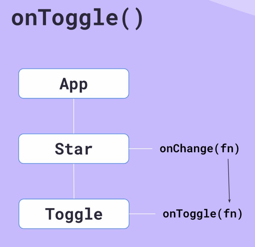
The request workflow will look as below:
export default function Star({ onChange }) {
    return (
        <Toggle onToggle={onChange}>
            <Toggle.Button>
                <Toggle.On>
                    <BsStarFill className="star filled" />
                </Toggle.On>
                <Toggle.Off>
                    <BsStar className="star" />
                </Toggle.Off>
            </Toggle.Button>
        </Toggle>
    )
}

//App.js
function App() {
  return (
    <>
      <Star onChange={() => console.log("Star toggled")} />
    </>
  )
}

//Toggle.js
import React from "react"

const ToggleContext = React.createContext()

export default function Toggle({ children, onToggle }) {
    const [on, setOn] = React.useState(false)

    function toggle() {
        setOn(prevOn => !prevOn)
    }

    React.useEffect(() => {
        onToggle()
    }, [on])

    return (
        <ToggleContext.Provider value={{ on, toggle }}>
            {children}
        </ToggleContext.Provider>
    )
}

export { ToggleContext }
The bug in this code is that the console is logged as soon as the App is executed. The database does not need to be called as
useRef() Hook
Refs are just like state, except changing them doesn't cause a re-render. They're frequently used for manual DOM manipulation. It could be paired with useState and useEffect in the app
const renderCount = React.useRef(/* initial value*/)
console.log(renderCount) // {current:0} an object property current of value 0

  React.useEffect(() => {
    renderCount.current++
  })
Code in action
React Docs explains on how Refs can be used for manipulating DOM elements. https://react.dev/reference/react/useRef#manipulating-the-dom-with-a-ref
For a newbie in React, its advised to not use ref with anything that needs a manual change in the DOM. Refs are beneficial when you dont want the page to be re-rendered.
Fix onToggle bug using refs
const ToggleContext = React.createContext()

export default function Toggle({ children, onToggle }) {
    const [on, setOn] = React.useState(false)
    const firstRender = React.useRef(true)


    function toggle() {
        setOn(prevOn => !prevOn)
    }

    React.useEffect(() => {
        if (firstRender.current) {
            firstRender.current = false
        } else {
            onToggle()
        }
    }, [on])

    return (
        <ToggleContext.Provider value={{ on, toggle }}>
            {children}
        </ToggleContext.Provider>
    )
}

export { ToggleContext }
Render Props
We know we can pass objects, arrays, and string values as props but can we pass functions?
In the example above, sayName is called inside Decision component, this function now has access to states defined inside the component. It can access the goingOut state defined in the component and pass it to the parent
export default function Decision({sayName}) {
    const [goingOut, setGoingOut] = React.useState(false)

    sayName(goingOut)
    function toggleGoingOut() {
        setGoingOut(prev => !prev)
    }
    .....
}

//App.js
function App() {
    return (
        <div>
            <Decision sayName={(goingOut) => {
               console.log(goingOut ? "I AM going out" : "I'm staying in")
            }} />
        </div>
    )
}
In React, data and props are passed from parent to child, and not vice versa. This is similar to how when addEventListener is added to a DOM element and event variable is passed to the callback function that has all the related data about the element.
In the same way in React, callback functions can be used to access the internal state of the child component and then based on the value, perform the action in the parent component.
render here is a function that returns jsx and hence the name render props :)
The more common way render props is used in React and the way 3rd party libraries would expect you to use is through children
function App() {
    return (
        <div>
            <Decision>
                {(goingOut) => {
                    return (
                        <h1>
                            Am I going out tonight?? {goingOut ?
                                "Yes!" : "Nope..."}
                        </h1>
                    )
                }}
            </Decision>
        </div>
    )
}

//Decision.js
    return (
        <div>
            <button onClick={toggleGoingOut}>Change mind</button>
            {children(goingOut)}
        </div>
    )
Custom Hooks
Hooks allow you "hook into" the rendering cycles of React. E.g. useState maintains variables across render cycles and triggers re-renders on change. useRef maintains values across render cycles without causing re-renders.
Custom hooks can be created by combining existing hooks into custom, reusable pieces of logic.
useEffectOnUpdate - Custom Hook
export default function useEffectOnUpdate(effectFunction, deps) {
    const firstRender = React.useRef(true)

    React.useEffect(() => {
        if (firstRender.current) {
            firstRender.current = false
        } else {
            effectFunction()
        }
    }, deps)
}
This hook can now replace the code in the Toggle component
export default function Toggle({ children, onToggle = () => {}}) {
    const [on, setOn] = React.useState(false)

    function toggle() {
        setOn(prevOn => !prevOn)
    }

    useEffectOnUpdate(onToggle, [on])

    return (
        <ToggleContext.Provider value={{ on, toggle }}>
            {children}
        </ToggleContext.Provider>
    )
}
The Headless Toggle component created previously can be simplified using custom hooks.
useToggle - Custom Hook
part 1 > Bring the useState and toggle function from the Toggle component to this hook.
export default function useToggle() {
const [on, setOn] = React.useState(false)

    function toggle() {
        setOn(prevOn => !prevOn)
    }
}
part 2 > useToggle returns 'on' and 'toggle' as an array
export default function useToggle() {
    const [on, setOn] = React.useState(false)

    function toggle() {
        setOn(prevOn => !prevOn)
    }
    return [on, toggle]
}

//Toggle.js
export default function Toggle({ children, onToggle = () => {}}) {
    const [on, toggle] = useToggle()

    useEffectOnUpdate(onToggle, [on])

    return (
        <ToggleContext.Provider value={{ on, toggle }}>
            {children}
        </ToggleContext.Provider>
    )
}
part 3 & 4> Remove all references of Toggle in all 4 Menu components and use the new useToggle hook to create state and toggle function
//Menu.js
export default function Menu({ children, onOpen }) {
    const [open, toggleOpen] = useToggle()

    return (
        <div className="menu">
            {children}
        </div>
       )
}

//MenuButton.js
export default function MenuButton({ children }) {
    return (
            <Button>{children}</Button>
    )
}

//MenuDropdown.js
export default function MenuDropdown({ children }) {
    return (
            <div className="menu-dropdown">
                {children}
            </div>
    )
}

//MenuItem.js
export default function MenuItem({ children }) {
    return (
        <div className="menu-item">
            {children}
        </div>
    )
}
After the changes, the menu stays open and click does not work
part 5 > Create MenuContext and export it. What values would be provided?
const MenuContext = React.createContext()

export default function Menu({ children, onOpen }) {
    const [open, toggleOpen] = useToggle()

    return (
        <MenuContext.Provider value={{open, toggleOpen}}>
            <div className="menu">
                {children}
            </div>
        </MenuContext.Provider>
    )
}

export { MenuContext }
part 6 > Access the needed context values in MenuButton and MenuDropdown components
//MenuButton
export default function MenuButton({ children }) {
    const { toggleOpen } = React.useContext(MenuContext)
    return (
        <Button onClick={toggleOpen}>{children}</Button>
    )
}

//MenuDropdown.js

export default function MenuDropdown({ children }) {
    const { open } = React.useContext(MenuContext)

    return (
        <>
            {open ? (
                <div className="menu-dropdown">
                    {children}
                </div>
            ) : null
            }
        </>
    )
}
part 7 & 8 > When there is an API to be interacted with on click of the Menu , the custom hook can be used as shown in the scrim below
With this, we are finished with Reusability section.