


Contents
UI Design Fundamentals
Build a simple layout
Full project refactoring
Design Fundamentals
White Space
Color
Contrast
Scale
Alignment
Typography
Visual Hierarchy
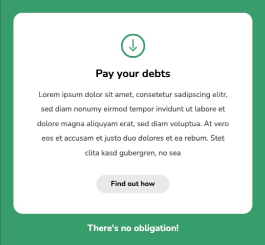
White Space
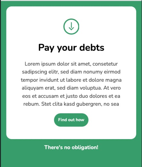
White Space is the empty space b/w the elements in the user interface. The primary properties to define white space in CSS are padding and margin.
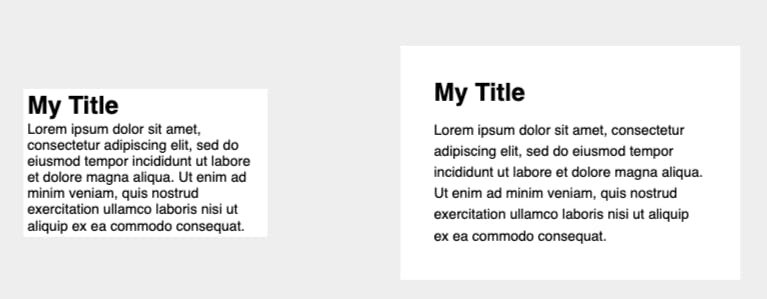
The only change applied is white space.
.secondary {
    padding: 1.9em;
}

.secondary h1 {
    margin-bottom: .5em;
}

.secondary p {
    line-height: 1.5em;
}
Alignment
Alignment in UI design is the process of ensuring that every element is positioned correctly in relation to other elements.
Before
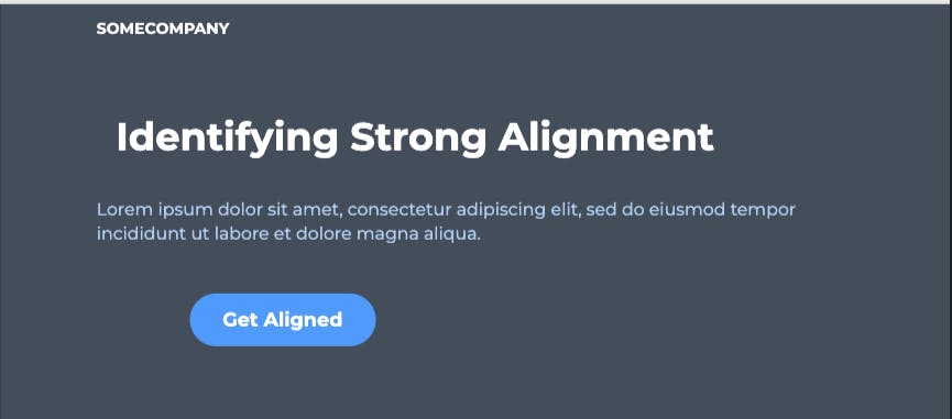
Each element in UI defines a series of rows and columns
After
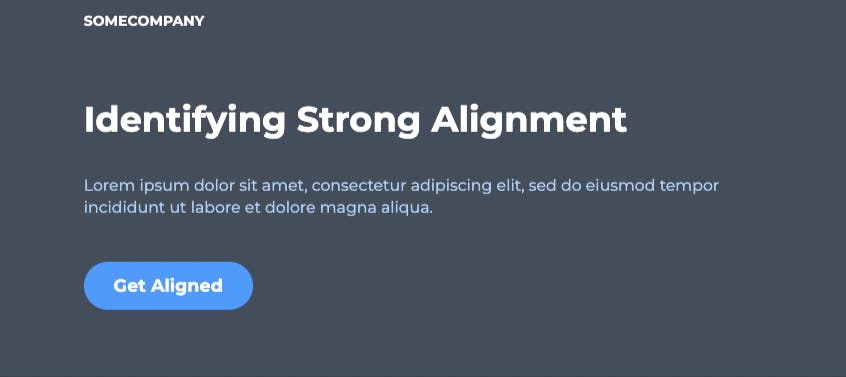
h1 { margin-left: 0; }
button { transform: none; }
a.logo { text-align: left; }
A codepen design challenge to practice (solution is js section)
https://codepen.io/hennasingh04/pen/JjxrBmE
Contrast
Contrast is defined as being in a 'strikingly' different state from something else.
WCAG 2.0 Contrast Guidelines
(minimum AA)
The visual presentation of text and images of text has a contrast ratio of at least 4.5:1, except for large text which should have a contrast ratio of at least 3:1.
(Enhanced AAA)
The visual presentation of text and images of text has a contrast ratio of at least 7:1, except for large text which should have a contrast ratio of at least 4.5:1.
Contrast Checking Tools
Browser Plugins
Websites
UI Designs Application Plugins (Sketch, Figma, Adobe Experience Design)
Before

After

p {
    color: #002A4E;
}

a {
    background: #006BC6;
    color: white;
}
Scale
Just as with alignment, white space, contrast, and the other fundamentals, the size of every UI element must be carefully considered.
Before
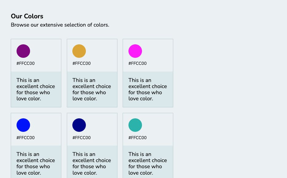
After
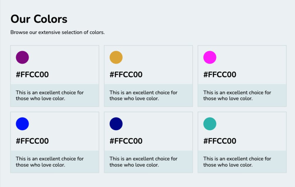
.color-container {
    grid-template-columns: repeat(3, auto);
}

h1 {
    font-size: 2.2em;
}

p.code {
    font-size: 1.5em;
    font-weight: bold;
}
Codepen for same - https://codepen.io/hennasingh04/pen/YzBrOWj
Design Challenge
Fixing below: https://codepen.io/hennasingh04/pen/NWoaLbK
Typography
Font Choices (1-2 max)
Visual Hierarchy (order of importance taking into account other fundamentals)
Font size (scale)
Alignment
Letter spacing & line height
Font styles (weight, italics etc)
Color & Contrast
Before

After
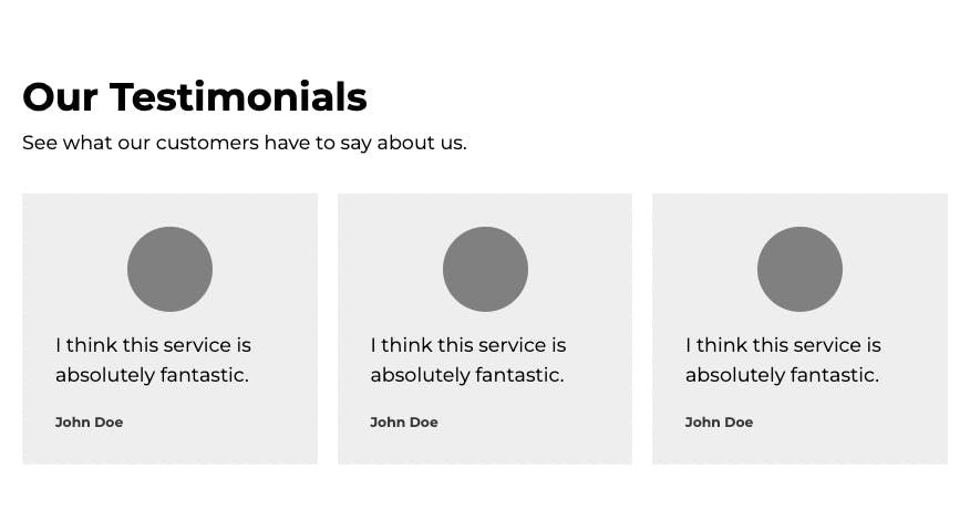
h1, p, blockquote p, cite {
    font-family: 'Montserrat';
}

h1 { /* Our Testimonials*/
    font-size: 2em;
}

blockquote p { /* The actual testimonial*/
    line-height: 1.5em;
}

cite { /*author*/
    font-size: .7em;
    font-weight: bold;
    color: #373737;
}
Color
The first UI design fundamental that shapes a user's experience is color. Using too many colors is not a good thing. Color contrasts are important.
Before

After
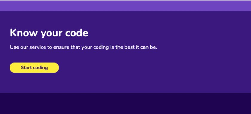
.container {
    background: #3C1581;
}

h1, p {
    color: white;
}

a {
    background: #FEED00;
}
Design Challenge - color
https://codepen.io/hennasingh04/pen/abXLQdz
Visual Hierarchy
Every element on a user interface has a level of importance. Some elements are more important than others. Visual Hierarchy is how we establish this importance.
A combination of different UI fundamentals can be used to establish a visual hierarchy

After

Design Challenge- Visual Hierarchy
https://codepen.io/hennasingh04/pen/ExrwGYZ
My Solution
Instructor solution
body {
    padding: 1.5em;
}

svg {
    width: 2.7em;
}

h1 {
    font-size: 1.2em;
    font-weight: bold;
}

.card p {
    line-height: 1.9em;
    color: auto;
}

a {
    background: #e9e9e9;
    padding: .7em 2em;
    margin-top: 1em;
}
Final Challenge
https://codepen.io/hennasingh04/pen/YzBrdwv
My solution
body {
    grid-gap: 2em;    /* Improve the white space */
}

.content {
    background: #1C6EFD;  /* Improve the color/contrast */
    padding: 1.5em 1em;     /* Improve the white space */
}

h1 {
    margin-left:auto;  /* Improve the alignment */
    font-size: 1.2rem;   /* Improve the visual hierarchy */
}
Instructor Solution
body {
    grid-gap: 2em;    /* Improve the white space */
}

.content {
    background: #0044B9;  /* Improve the color/contrast */
    padding: 1.5em;     /* Improve the white space */
}

h1 {
    margin-left: 0;  /* Improve the alignment */
    font-size: 2.3em;   /* Improve the visual hierarchy */
}